Sunday, June 30, 2013

Name Signs (2011 and up)

As a baby shower gift I like to give something personal. Nothing is more personal than a sign with the name of the baby.

 Up until now I have made 3 signs:

Jason the son of my niece
"Jason" was my first sign. He's the son of my niece. My niece always loved panda bears. The baby room also got a panda theme. It was more than logical to add a panda bear to the sign.
The letter and the bear are separate from the sign and made out of wood.
I added 2 stickable eyelets to hang the sign as well as 2 feet on which the sign can stand on a shelf for example.

Morris is the son of another niece.
I'm sorry for the discoloration, this picture was made in the evening with my phone.
 The second one was "Morris" the son of another niece. This sign was designed like the birth card we got. The font is hand drawn from the original, since I didn't have it on my computer.
The letters as well as the bird and its wing are glued on the main sign.

Ruben is the son of a guy from FruitCorso
Last but not least: "Ruben".
This one has to be the most work because it has a lot of detailed paintwork.
For size: The cauliflower is about 15 cm width and it's glued on top of the sign.
Ruben is the son of a guy that works with me at FruitCorso. He was always nagging he would make a cauliflower as a design which would consist out of cauliflowers and cauliflower leaves.
Because of that I designed my own Anne Geddes inspired cauliflower baby.
Next to that I added all the information from the birth card, trying to use the same font.


I enjoy making signs like this. If you're interested and live in Holland, send me a message and I'll see what I can make for you.

Drawing Box (2011)

Another birthday project. A friend of mine asked drawing supplies for her birthday. 
Sure I can give you that, but I'd like to put them in a personal storage box.


Finished box.
You might have guessed her name already. Her name is Linda. I sawed those letters out of some MDF. The box itself is made from multiplex.
It has a lid, underneath it are 3 compartments. A large one for pencils and the other 2 for a model man and some other small supplies.
At the bottom there's another small compartment. That lid can be pulled forward and is a good storage for drawing books (which were also included in this gift)

Top view.
 To make the wood look more old I used some diluted acrylic paint. That way it works in the same way as staining.
I also added some silver lines and some fake diamond plate which was glued to the sides and the inside of the lid.
The compartments have a black soft pillow.
Opened box with all the items I bought inside.

The easy way is to just buy a ready to go drawing box and use the techniques I described to make it look older and such. But because of the books and also the price I made it myself. 

Display Rack (2011)

In my room I have a lot of items, but due to the shape of my ceiling (diagonal parts) it is almost impossible to put a closet inside. So instead I decided to make a rack to display a bunch of my cool items like books, action figures and DVD box-sets.

I wanted it to look like something that could be in a movie, something Steampunk related.
Therefor it would be needing wood, gears and some metal pipes. Off course I cheated on the metal and used PVC pipes and wood to recreate those things.

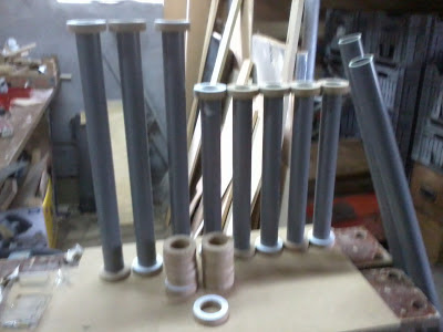
PVC pipes with MDF rings.

I sawed a couple of rings which then were sanded to round one outer edge.
These were then glued to the PVC pipes, using an extra thick layer (several layers to be more precise) of wood glue to mimic a welded line.

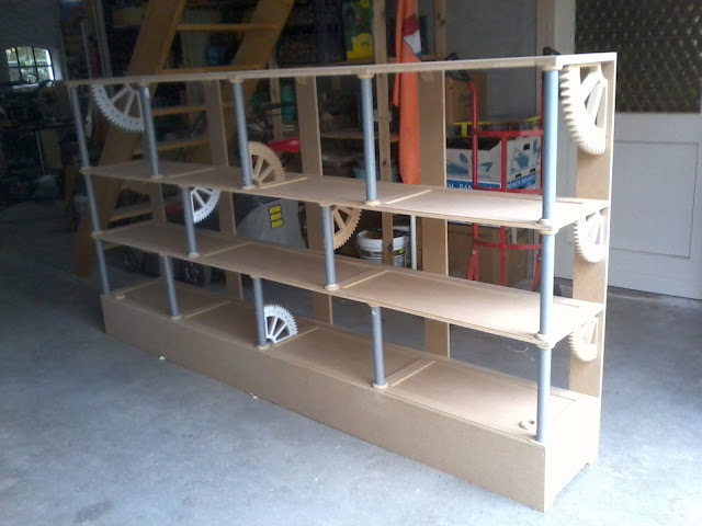
The whole unpainted version of the rack.

Because there are radiator pipes against the wall this rack had to start 20 cm off the ground. That is why there's this big "box" at the bottom. I could've made some drawers in that now "useless" space.

I also wanted to give the whole piece a bit of a royal vibe. For that I bought some crimson red velours which I glued around wooden plates of MDF which fitted perfectly between the ledges.
The finished rack

The whole rack was painted with an orange/ amber primer and finished with a chocolate brown paint. This paint was softly sanded on the edges so it would get a more old worn out look.
By now I know how to pain wood, if I had known back then, than I would've used those techniques to turn this rack into an old wooden one.

Detail shot from the gears. Notice the thicker glue line representing a weld.


A year or so later I noticed that I still had a lot of crap I stored on the lower shelf. This didn't look pretty in sight. To "hide" these items I made some doors to close the lower part of the rack. These doors were painted in the same colors as the rack itself but next to that I added a glass window. Behind it I could place a wooden board (covered with the same red fabric as used in the rack) and I added some old technical etches I found on the internet.

Those etches were placed into Photoshop onto some text, I found about the item, from Wikipedia. The whole text background was turned a bit more antique (lower contrast, typewriter font, some stains and a faded boreder). I printed it on creme colored paper to make it look even older.

Close up of one of the 4 doors that were put in later on.

And some time later I added some latches underneath the shelves, because the books were too heavy for the MDF. These latches prevent the wood from bending so it can hold the books better.


The finished rack (without the doors) filled with the many items I have.
(notice the flower buds on my desk from Magnolia Magnificus)

Saturday, June 29, 2013

Book stand (2011)

Personally I don't like to read, I just don't have the concentration to keep me focused page after page. I rather see a movie. None the less I do own a collection of fantasy related books; mostly encyclopedias and how-to-draw-books. Some of those books contain beautiful pictures of fantasy creatures. Therefor I wanted to build a book stand on which I could put a book with its pages open.

Finished book stand with a book about fantasy creatures (a Gryphon to be more precise)

It's not one of the biggest projects, but a fun project in between.

It's entirely made from MDF. If I should remake it I would choose a different wood type like plywood, because it doesn't bend as much as MDF does on the small parts of the bottom, which I would also make a bit bigger next time.

I designed this directly onto the wood instead of making a template. I took some angles that seem to look nice and added a nice old curly pattern to it.

When it was all sawn out I painted it with black primer, then I put a layer of gold paint on top of it, letting the black background shimmer through at some places.
And as an extra worn off look I added some black acrylic paint at joining edges.


The book stand shown from its side.

Wind vane Swans (2011)

A woman at our Fruitcorso club asked if I could make a wind vane with swans for someone's birthday.

It seemed like a nice idea so I made it for her.
She had a template of 2 swans with their heads against each other so a heart shape was formed.
The finished wind vane

I took this template and sawed it out of some thin plywood.
The rest of the vane is also constructed out of plywood. This was done because MDF would get mushy after staying in the rain or any moist environment for too long.

The wind vane stands on a small rod with a sharpened end.
In between there's a cylinder preventing the vane to be taken off.
Then there's another cylinder, but it's from the vane itself, preventing it from tipping over. This cylinder also contains a bearing to prevent friction from wood on wood.
And another cylinder to finish off.

The 4 wind directions are made from solid plywood; this means the letters and the rod are all from one piece, making things more sturdy.
I used a dremel and a sanding machine to round things and flatten the letters.

In the end the woman wanted me to paint the swans in a more realistic pattern.

A close up from the heart shape.

If you ask me if it works. Let's just say that it turns easily, if it really points towards the direction of the wind; I don't know (but that didn't matter for this assignment)

Saturday, June 15, 2013

FruitCorso Magnolia Magnificus (2011)

As said before I entered the 2010 competition with a concept for a FruitCorso float. Unfortunately our club didn't have enough members to help me out to actually get it on the road. Half way we decided it was better to leave it be and continue for the competition next year.

That we did and we did our best to finish it on time. It was still a lot of work and some things of the first drafts were left out to save some time.
The float as it was driven (by my dad) at the FruitCorso Parade.
About the design:
The name of this float was Magnolia Magnificus. She was made up by me when I was working with Magnola seeds the year prior (2009).
Magnolia was a dryad (I found out later), half woman, half tree. She was the mother nature of ancient Greek times. I also made a story about her.

In short:
Magnolia Magnifucus was hired by Zeus to make a garden for Hera. She did her best and with her powers she created the most beautiful garden in the entire world. There was only 1 problem: Hera was sort of allergic to Magnolia. Hera's powers were drained as she got close to her. In her rage she destroyed the whole garden. She even threatened Magnolia she would be next. Zeus quickly stepped in and took Magnolia to safety. He thought of a new assignment to keep her save. That assignment was to protect an apple, but not just a regular one. No, this was the fruit of the Gods; Ambrosia, as she was told. For her own benefit Zeus kinda lied. That wasn't the real Ambrosia, but it would keep Magnolia far away from Hera.
Magnolia was allowed to pick her own temple for this task. They searched and searched but none of them seemed fit, until they passed an old ruin. Magnolia brightened at the sight. This...this pile of rubble and debris taken over by nature itself. This would be her temple. She was able to see it as the most gorgeous thing in the world even if no one would see the same. And there she would spent the rest of her days; Happy and safe.


On the first story she had her own guardians: A Minotaur and some flesh eating plants. The Minotaur got skipped from the first draft because it was too much and it didn't fit with the plant theme. This Minotaur how ever got to be our last minute design for last year.
The flesh eating plants were unfortunately skipped due too our time trouble.
Below you can see how the first idea transformed into something way better.

The 1st attempt maquette of 2010.
The renewed maquette of 2011.

A beautiful close up from the apple.
FYI: The maquette is made by paper mache, some wood, paper (flowers), and some clay to smoothen her face.

As every year there's a big presentation on stage of our local theater. We were allowed to also enter with a video, so I made an intro video:


Picture time:
To show the build up I'm gonna put some pictures down below.
This is about where we left her the prior year. It mainly is a steel framing,
a few pilars (huge pvc pipes) and feet made of Styrofoam.

And here is that same foot, but now it's finished. 
The skin tone is done with small seeds. We needed a bit of a tanned woman because she's Greek.
Next to that we used a lot of grapes, unions, hazelnuts and the green products are Brussels sprouts.


This is her face from the side. 
 Her face had some patterns. I have a book with several old templates and one of them had that swirly type of pattern so I used that on the side of her face. We glued Brussels spouts on it and some Romanesco (tower cauliflowers).
The hair was a lot of work. I had a lot of help from a regular designer (Bert van Erkom) to think of the right products and how to use them.
Every piece of fruit/ vegetable was put on a stick. Those sticks would then be pushed into the Styrofoam head. The main products were: Apples, potatoes, beetroots, rhubarb, bunch of grapes, decorational cabbage and red unions.

Front view of the whole float.


Backside. I'm sorry for the bad colors; we don't have sufficient light in the shed.
The pattern we saw earlier in her face returns on her back.

The evolution of Zeus
We had a lot of detail work; it's one of my traits, but not everyone is happy with that, since it will always be extra work.
On the left over walls of this ruin I wanted to have 3D paintings of both Hera and Zeus. These figures were made from Styrofoam and glued to the wall. Then some drapes were hung around it and stiffened with some paste. After that our natural routine of seeding started.
His beard is done with cauliflower.

We had one mega issue this year: We got over 4 meters. This meant we needed some kind of mechanics to lower her head.
A volunteer mechanic was able to get some hydraulics inside to make her head tilt. Every year we try hydraulics we fail. Normally it wasn't bad for the design an element wasn't lifted, but this time it would be bad if her head wouldn't get up anymore.

This video shows how our haudrolics did their work.

Magnolia laying down as she wouldn't fit through the doors of the shed.


This video was not made by me, but by someone in the crowd.
We had the luck the float stopped right in front of him.

There are so many things I could tell about this float since it has so many elements. But I think by now you have a fine idea about the how we made it. If not, feel free to ask.

If you're curious: We ended at the 10th place (out of 12). There was a lot of critique about the colors; orange wasn't right according to the judges. But in defense; old Greek vases were terracotta and black.
Also the expression of the woman wasn't right. She looked a bit frightening instead of happy. This was due to the face we hardly ever worked with Styrofoam before and the people who put the head up didn't lift it up far enough, therefor her eyes look more creepy down to the crowd.
1 Thing I'm still not happy about was her "bra". I wanted to have leaves on her left (viewers right) boob, but the regular designer said this was the better solution. I have listened a lot to him and most of the things he was right of, but this one...no, leaves would, in my opinion, be better.

None the less I'm proud of the end result.
It was quite an adventure, but it takes so much spare time and it's a lot of communicating, trying to make your plans clear and there are a lot of discussions, which made me decide to not do another design in the near future.
However I do help out the recent designer with ideas and solutions. This "assistant" job suits me way better.